The Magic of Crafting Exceptional User Interfaces


Imagine a digital world where everything feels just right. Where clicking a button is as intuitive as breathing, and navigating through menus is as effortless as walking through a familiar park. That’s the magic of a well-designed user interface!
In this article, we’ll dive into the secrets of crafting UIs that are both beautiful and functional. We’ll explore the principles and best practices that will make your users feel like they’re in a warm, cozy hug — and that’s exactly what we’re all about!
Get to Know Your Audience
Before you start designing, you need to get to know your audience. What makes them tick? What are their pain points? What are their favorite things? By understanding your users, you’ll be able to create an interface that speaks directly to their hearts (and brains!).
Layout Magic
A well-designed layout is like a work of art. It’s all about creating a flow that’s both logical and visually appealing. Use negative space to breathe new life into your design, and don’t be afraid to experiment with different shapes and colors. The key is to create a sense of harmony that guides the user’s eye effortlessly.
Simplicity is the New Black
Less is often more when it comes to design. By stripping away non-essential elements, you’ll create a sense of clarity and focus that’s hard to ignore. Think of it like editing a sentence — sometimes less is more.
Guiding Light
Your design should be like a trusted friend — guiding the user through the interface with ease. Use clear and concise language, and don’t be afraid to use visuals to break up the text. Remember, the goal is to make your users feel empowered and in control.

Typography and Color: The Dynamic Duo
Typography is like the rhythm section of your design — it provides the foundation for your message. Use a consistent font palette, and don’t be afraid to experiment with different sizes and styles. Color is like the melody — it adds emotion and depth to your design. Use it wisely to convey meaning and create a sense of connection.
[Image: A typography sample with different font sizes and styles]

Visual Content: The Cherry on Top
Visual content is like the icing on the cake — it adds an extra layer of depth and emotion to your design. Use high-quality images, illustrations, or icons that add meaning to your message. And remember, simplicity is still key — don’t overdo it!
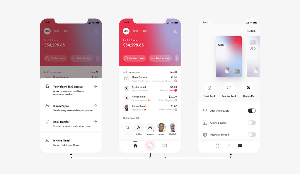
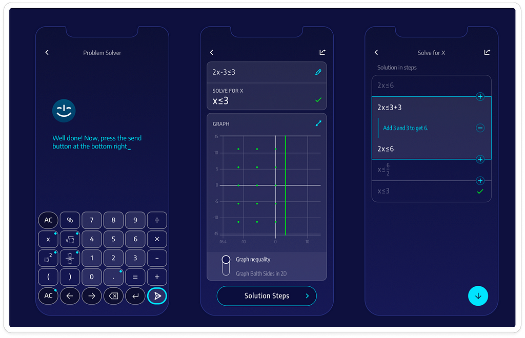
[Image: A high-quality image with a simple design]

Innovation Nation
Innovation is like the spark that ignites a fire — it can create a sense of excitement and wonder that’s hard to ignore. Experiment with new technologies and design elements, but always keep your users in mind. The goal is to create something new and fresh, not confusing or overwhelming.

Consistency is Key
Consistency is like the glue that holds your design together — it creates a sense of familiarity and trust with your users. Use a consistent color palette, typography hierarchy, and design language throughout your interface. It’s like wearing a favorite outfit — it feels like home!
By following these principles and best practices, you’ll be well on your way to crafting exceptional user interfaces that delight your audience and leave them feeling like they’re in a warm hug. So go ahead, get creative, and make some magic happen!
Related articles


